B2B BNPL - but make it sexy & simple

⚡ 😎 ⚡

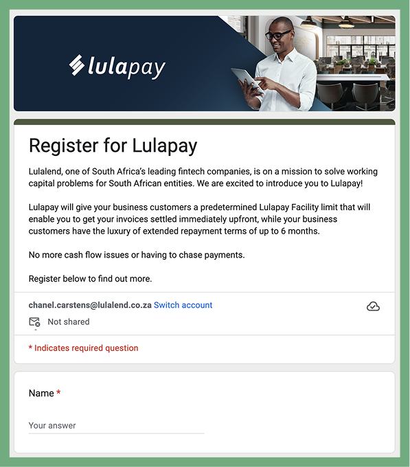
Lulapay is Lula's B2B Buy-Now-Pay-Later product for South African SMEs, and it was their fastest-growing product. For five years, the entire experience ran on a Google form, spreadsheets, and a lot of very patient support staff.

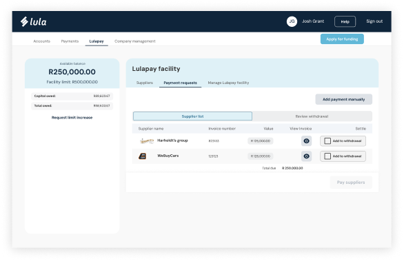
The numbers said this needed to be a real product. The sales model said suppliers needed a self-service link they could send customers, because every new customer meant another support ticket, another Excel sheet, another call to ask "how much do I owe?"

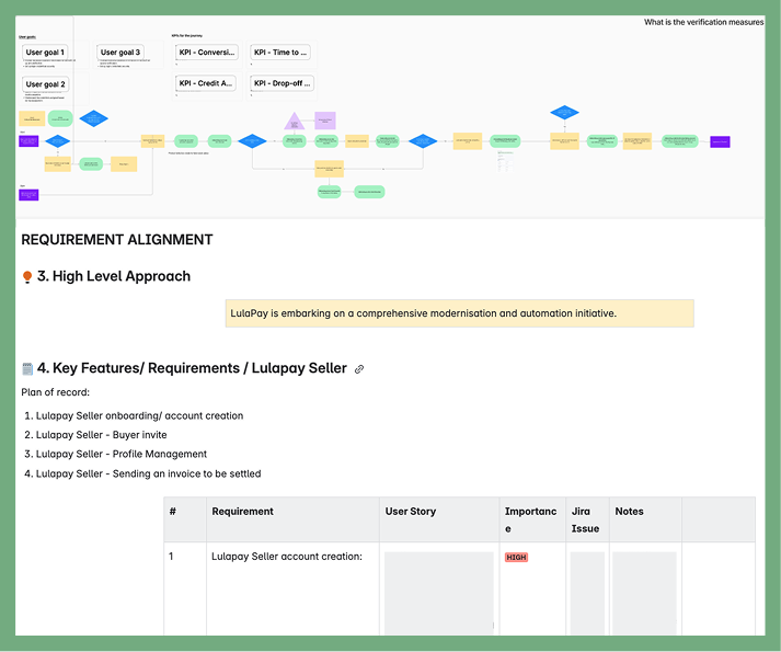
That wasn't a UX problem. It was a scale problem. And this is how I solved it.

Lulapay prototype preview

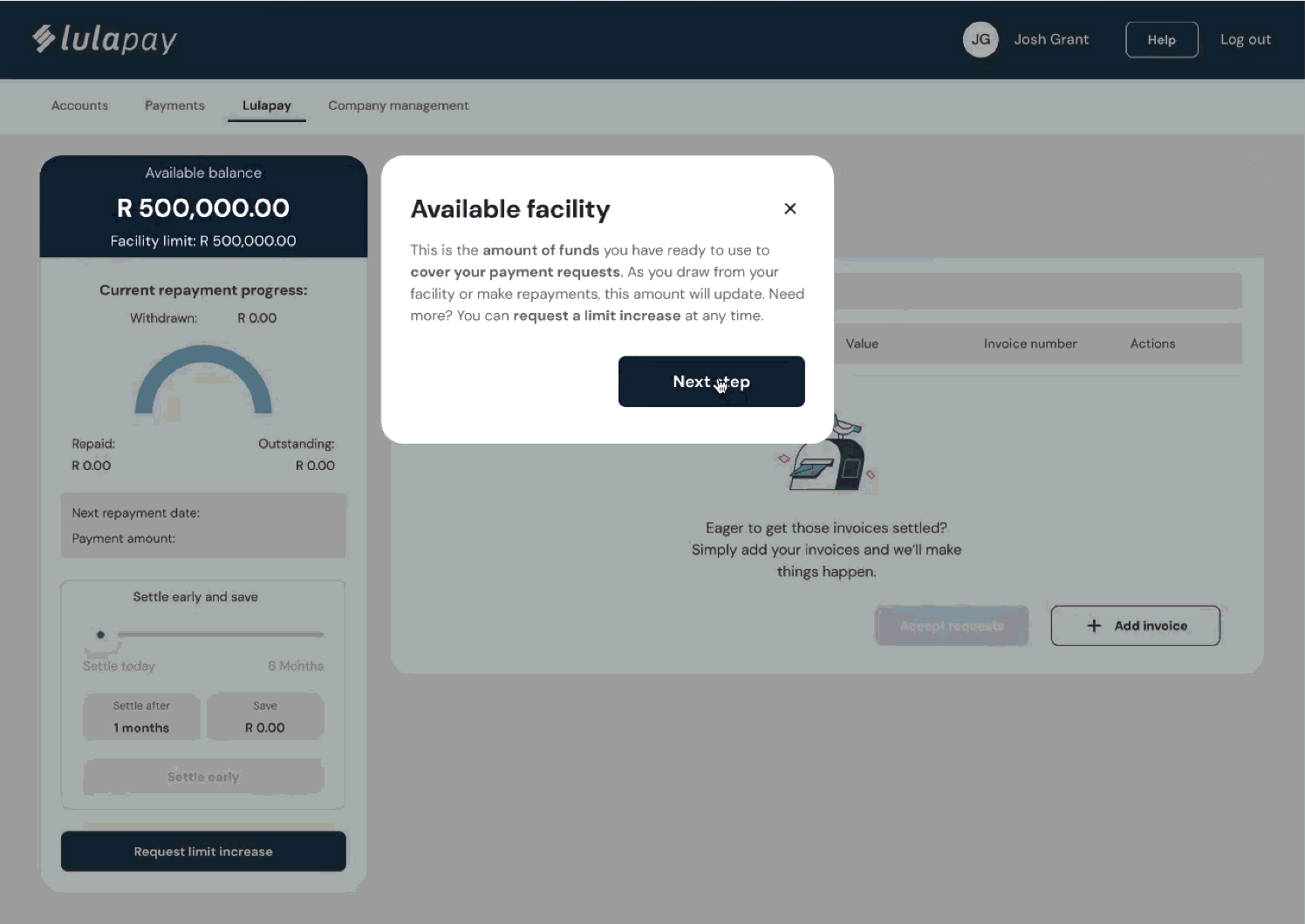
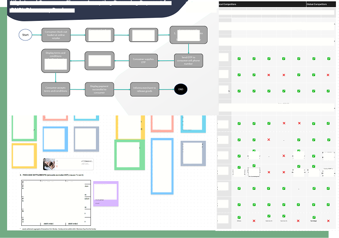
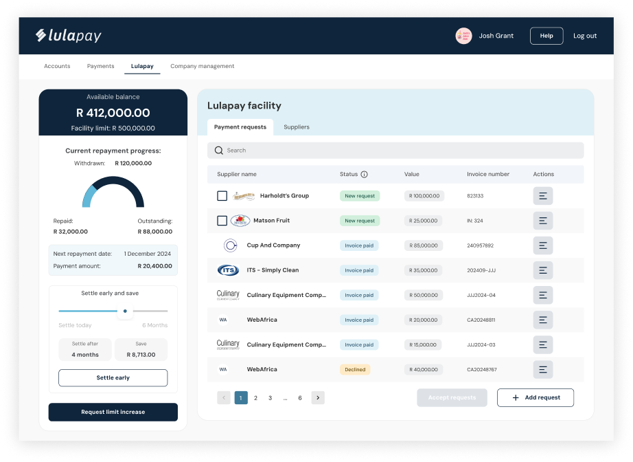
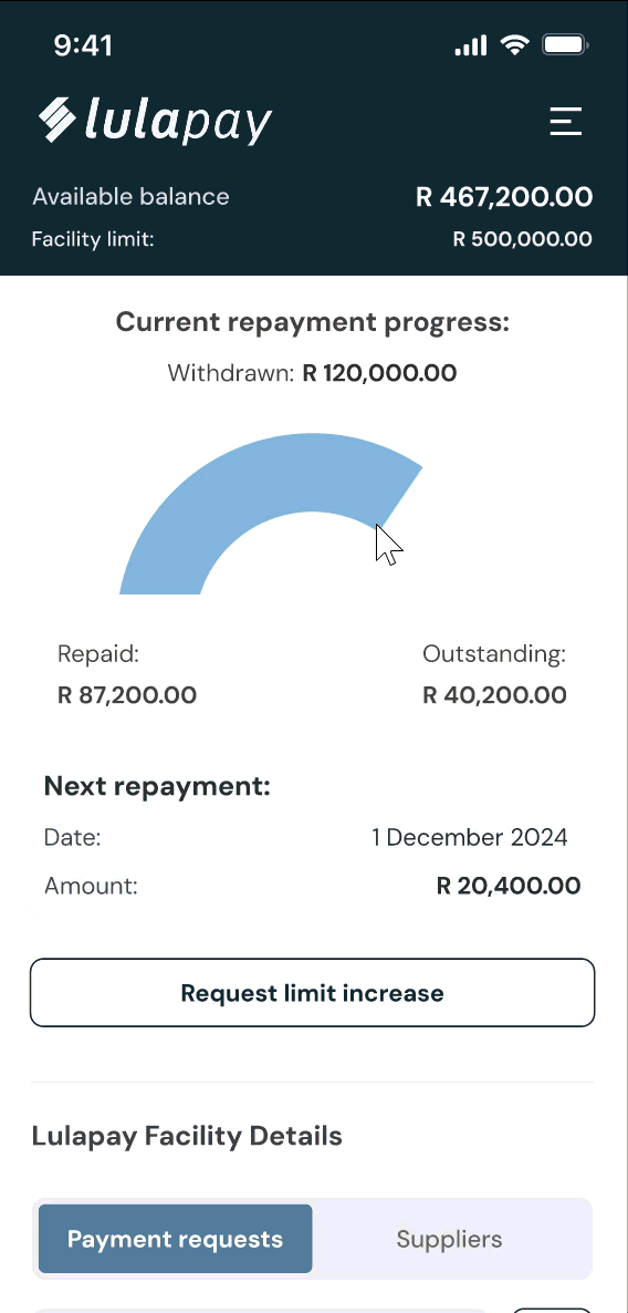
Object 1: A preview of the current prototype used for customer usability testing.

TL;DR

Lulapay was Lula's fastest-growing product and it was running entirely on a Google Form, spreadsheets, and a lot of very patient support staff. I owned the project end-to-end: research, design, testing, dev handover, and rollout comms, across desktop and mobile, for two connected portals. The hardest part wasn't the screens, it was figuring out what a fintech product that touches people's money actually needs to feel trustworthy, clear, and self-sufficient. I handed over a tested, dev-ready product with off-system comms.

Lulapay sign-up Google form

Object 2: The current Lulapay sign up Google form

A Spreadsheet, A Google Form, And A Fast Growing Product

Before I joined the Lulapay team, how were customers using the service? A Google form. If you wanted any information about your facility, a cost breakdown, repayment schedule, anything, you had to contact support during office hours and wait for someone to build you an Excel snapshot.
A snapshot that was already out of date by the time it hit your inbox.

Lulapay's customers are loyal. Some had been using the product for five years. They didn't leave, but they had been asking for a self-service portal from the beginning.

The advantage of running a product entirely through email for that long? We had years of real, unfiltered user feedback. We knew exactly what frustrated people, what they kept asking for, and what they genuinely loved. We didn't need to start from scratch, we needed to build what users had already told us they needed.

The Brief Was A Portal. The Problem Was The Experience.

Build a portal was the brief. But the deeper problem was this:

Users lacked visibility and control in the Lulapay experience.

For suppliers

  • long turnaround times
  • dependency on the Lula team for basic actions
  • no way to see whether a customer had enough available facility before sending a request

For customers

  • no way to track payment requests
  • understand what they owed
  • manage repayments proactively unless they called someone

Internally, the support team was spending significant time bridging these gaps. Serviceable, but not sustainable for a product growing this fast.

The design challenge:
How might we give suppliers and customers more autonomy, clarity, and ease, without overcomplicating the experience or overwhelming them on day one?

A note on scope: the PO was on maternity leave for 90% of this project. I owned the full scope, design, functionality scoping, dev liaison, QA tickets, testing, and rollout, end to end.

Supplier user journey and requirement alignment

Object 3: Supplier user journey and requirement alignment with priority matrix

Ideation and planning board snippet

Object 4: Snippet of ideation and planning board

Early customer portal wireframes

Object 5: Early customer portal wireframes

Designing Where The Money Lives

With years of user proximity and a clear problem statement, ideation was focused rather than exploratory. I looked at international B2B BNPL platforms (local competitors barely existed at the time) to understand what worked, what didn't, and what patterns users already had intuitions about.

But Lulapay isn't just a portal, it's a funding product. That meant designing around credit checks, financial regulations, data flowing through Lula's backend systems, and the very real risk of overwhelming first-time users on a product where money is on the line.

I used a Shift-Left approach: bringing Engineering and QA into the ideation stage rather than handing over polished designs later. This kept feasibility conversations happening early, which meant fewer surprises and smarter decisions.
I also kept in constant touch with the VP and client-facing teams, to ensure we remained aligned on our outcomes.

The north star for both portals: Simple. Clear. Designed for ease of use from day one.

Two Portals, Four Surfaces, One Product

With clear user goals and constraints in mind, I started building out interactive prototypes for both supplier and customer portals.

The aim wasn't just to visualise the flow, it was to simulate the experience:
how users would interact, what they would see first, and where they might get stuck.

I focused on designing something that felt familiar and easy to understand, especially since BNPL is still a relatively novel concept in the B2B space.

I designed desktop and mobile experiences for both the supplier and customer portals, four surfaces in total.

For suppliers, the core functionality included:

  • A simple onboarding/introduction journey
  • Adding customers
  • Sending payment requests
  • Viewing customer status and available facility
  • Tracking current payment requests and statuses
  • Basic reporting
  • Profile and settings management

Because adding customers and sending payment requests were the primary tasks, I designed those actions to be accessible no matter what screen the supplier was on.

The supplier journey was designed to be simple and task-focused:

  • → Add a customer
  • → Send a payment request
  • → Confirm payment status
  • → Get paid
Supplier user journeys

Object 6: Supplier user journeys

Active supplier portal

Object 7: Active supplier portal

For customers,

  • An onboarding flow that would capture all information credit required in order to open facility, avoiding any additional requests later on
  • The ability to add suppliers
  • Accept, edit or decline payment requests
  • Real-time tracking of their facility
  • Visibility of next payment amounts and dates
  • Encouragement to settle early
  • Requests to increase their facility

Unlike suppliers, customer interactions were ongoing. There was more nuance and more information to manage. So I focused on making that information:

  • → Easy to find
  • → Easy to understand
  • → Consistent across all pages

At this stage, I wasn't aiming for a polished final product. I was aiming for something testable: a clickable, guided experience that could surface gaps, confusion or friction points before it got to development.

One deliberate call: the "Settle early and save" calculator. Early settlement benefits Lula's business model, and users with cash available often didn't know it was even an option. Making that visible and tangible, with a slider showing exact savings at different points, turned a hidden feature into a motivating one.

On design system thinking: I stay close to the DS by default, because designing or building something twice is fun for no-one. But during testing, I identified a specific case where our notification colours weren't working. Users weren't registering them as alerts. I made the call to break from the DS there, documented the reasoning, and flagged it as a component worth revisiting.

Customer portal requirements

Object 8: Customer portal requirements

Active customer portal

Object 9: Active customer portal

Twelve Users Said Yes

I planned and ran usability testing with 12 participants across both portals, 6 suppliers, 6 customers, covering a range of experience levels, industries, and demographics.

I wanted to stay focus on our outcome questions and constantly referred back to them to ensure we were solving for our customers and validating any assumptions we had.

I wrote the test script, recruited participants in coordination with the VP and customer-facing teams, facilitated every session, and sent stakeholder debriefs after each test day.

What we learned:

Supplier portal:

  • High task completion across the board. All participants said they were confident they could master the portal with time.
  • 100% said the portal would be useful and valuable.
  • 100% were excited about the release and expected it to speed up their process significantly.
  • One clear friction point: users instinctively tried to hover over status badges for more information, but the tooltip was hard to find. Once they found it, they referenced it constantly.
Graphs of findings from usability testing

Object 10: Graphs of findings from our usability testing (information redacted)

Notes captured during a Supplier testing session

Object 11: Notes captured by my notetaker during one of our Supplier testing sessions

Customer portal:

  • 100% found the guided walkthrough valuable.
  • The "Settle early and save" calculator was a standout reaction. Users found it motivating, and multiple participants immediately asked for one addition: the full settlement amount, not just the savings. I implemented it.
  • Same status discoverability issue as the supplier portal surfaced here too.

What changed as a result:

  • Hover-activated tooltips added to status badges on both portals
  • Ability to add a note to declined or edited requests
  • Notification colour updated (breaking intentionally from the DS)
  • Full settlement amount added to the early settlement calculator
  • "Created date" column added to customer portal

I compiled two final deliverables: a stakeholder-facing summary with themes and highlights, and a dev-ready implementation doc with prioritised recommendations, quick wins, and a backlog for future sprints.

"It has all the little things I was worried about — the things I've been struggling with." - Participant 2, F, 40-49, Gauteng
"Seeing this come to life, I think Lulapay is an awesome product, and this sort of platform will allow suppliers to track and trace whats happening on their clients facilities, it's above the rest" — Participant 9, m, 30-39, Western Cape

The Off-Platform Experience

Once testing was complete and designs were iterated, I worked with the scrum master to create dev and QA tickets for both portals, and collaborated with the product and marketing teams on rollout planning.

One piece that often gets overlooked: the off-platform experience.
Lulapay's onboarding involves legal agreements, credit checks, and first-time interactions with a fintech product. The email comms needed to earn trust at every step. Around 50 emails needed to exist before launch, covering invites, repayment reminders, status changes, and edge cases, all in plain language with no jargon.

I wrote them with AI as a drafting partner. Days instead of weeks, while I was running QA sessions, supporting dev, and finishing the mobile design. AI also helped me pattern-match across 12 usability sessions and surface findings I might have missed at the volume I was working at. This was early days for AI in design workflows. It's standard now, but at the time it was the difference between handing over a complete product and handing over a half-finished one.

By the time I handed over, Lulapay had:

  • Two fully tested, dev-ready portals (desktop and mobile)
  • A staged rollout plan
  • A complete set of onboarding and lifecycle email comms
  • A prioritised backlog based directly on user research
  • A mobile design already underway

The portal didn't just replace a Google form. It gave a fast-growing fintech product the infrastructure to scale.

Supplier mobile experience

Object 12: A sneaky peek at the supplier mobile experience

If you have any questions or would like to get in touch, click on the box ← here to contact me or look at some of my other projects.